FXGUIDE : What’s the Dish on Cinesite’s Beans?
When Cinesite wanted to promote their animation capabilities and add to the studio’s already impressive showreel, they decided to push forward on a short film. That project became Beans, a faux commercial directed by animator Alvise Avati and produced by animation director Eamonn Butler. We talk to both artists about the evolution of this moon-monster caper with a musical end.
Concept
“When I came to Cinesite,” says Butler, “I wanted to update the animation reel for the company. Normally we have to wait to bid work, win work, for the film to come out, and then show it on the showreel. But to make it happen quickly I brought in Alvise Avati to write and direct the film.”
Avati, who had previously made another fake commercial about Coca-Cola versus Pepsi, wanted to make something much more simple. “I was doing that other short at home in spare time with a few friends and working remotely,” he says. “It took me almost a year. So for Beans I just wanted to move to almost one shot and making people laugh – that’s the most important thing to me.”
Moon reference
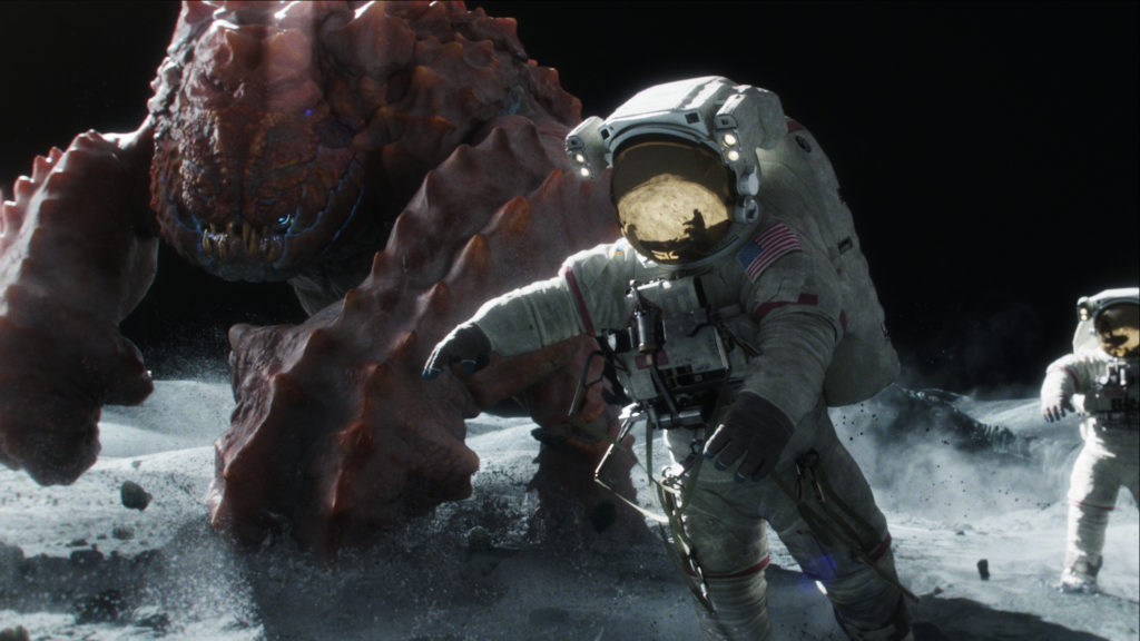
Spacesuit design came from photographs taken from the Apollo 13 mission. Cinesite also looked to archival films and a famous book called ‘Full Moon’. “The first thing that struck us was that they were color photographs but they all looked completely de-saturated,” notes Butler. “There was not a hint of color. So we noticed also that a little bit of color on the moon really pops. And because it was so bright on the moon, it’s essentially extremely bright so that’s why you get this really long depth of field.”
Butler and his crew began making notes of the visual cues that show up in photographs taken on the moon that would inform the look of the short. “It’s funny,” admits Butler, “we really fought with it in the grading process. There’s a strong tendency for it to look fake. But there were so many chromatic aberrations, halation on the lenses and dust. All the dust on the moon has a static charge to it so it sticks to everything so we added that in post.”
“There’s also a perception of the moon that it’s really dark,” continues Butler. “But it’s completely opposite to that, which is why visors worn by the astronauts are so filtered. One reason might be that shadow areas are so dense and dark that it makes you think it’s nighttime, even though it’s daytime. Similarly, you don’t see stars in the photographs, so we decided not to render them. That’s because it’s so bright that they probably used a very small aperture on the camera and so stars would not have shown up in the renders.”
CG creations
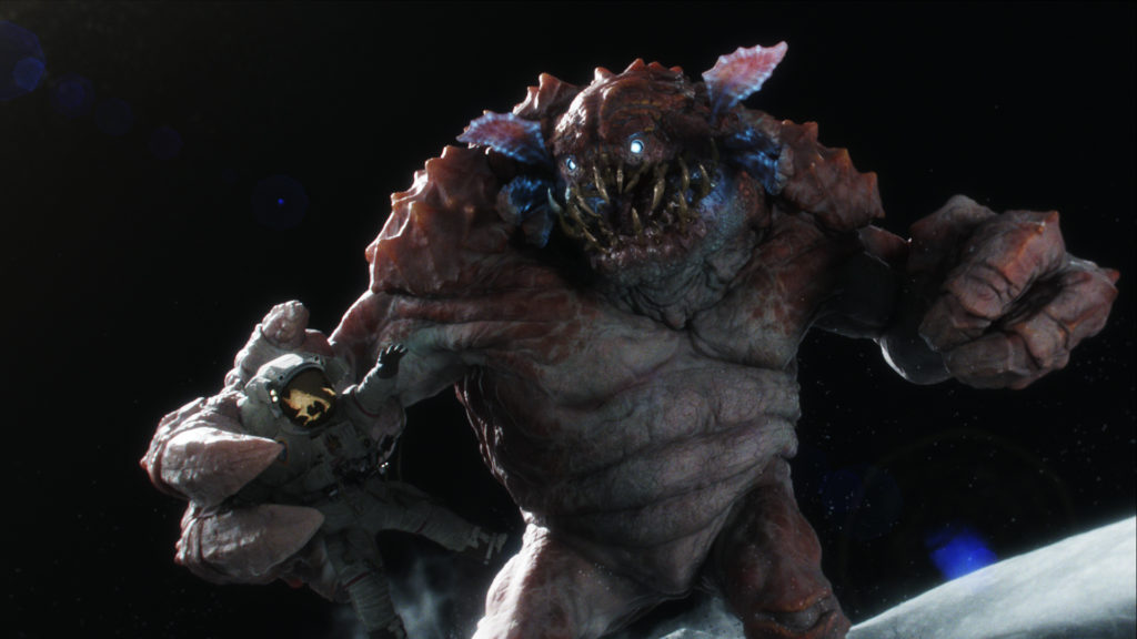
Cinesite began designing the crab-like creature in Sculptress, with modeling and texturing continued in Mudbox. Maya was then used for animation, rendering done in RenderMan and compositing in NUKE. An interesting texturing reference was required for portions of the astronaut’s bodies scene when the monster breaks one in half. “Alvise actually photographed some Italian deli meats on a plate – salami, pastrami – and we textured that in,” says Butler. “So inside the astronaut is some rather delicious delicatessen meats.”
Animation
“The original idea was to show the entire action through the reflection of the mirror of one of the astronaut’s helmets,” outlines Avati. “Then only at the very end would reveal that was being seen in the reflection – but was too complicated technically to create.”
Instead, the action – in which astronauts quickly discover the presence of a ‘space lobster’ on the moon – ultimately happens in one shot. That was made possible through a process of rough previs – blocking animation, work in progress animation and then final keyframe animation followed by a choreographed camera move. “At first it looked like the guys were only running in slow motion and the action looked dull, so I moved the camera closer to the astronauts. As soon as I did that the energy of the action was really increased. We also tried to keep the camera lower to the ground as that made the monster more imposing – the bigger it appeared in frame.”
For the astronauts themselves, Cinesite considered reference of moonwalks for reference. “It looks initially like normal gravity slowed down, but that’s not right,” explains Butler. “What happens with astronauts is that their center of gravity changes completely. There was footage online where an astronaut kept falling over. They could right themselves with just a little flick of a foot. There’s still weight and consequence to actions.”
In the end, the filmmakers did not adhere strictly to the rules of ‘moon gravity’ for the astronauts. “Part of our gag was that we wanted our astronauts to struggle to get away from this creature,” says Butler. “So when they run and jump, they’re limited by the suit. They do little bunny hops which looked funny and interesting and cool. And we didn’t want the monster affected by the moon because the gag was they’re in his garden.”
Sound design
Avati recounts that as part of the rough animation process, layers of scratch audio and sound effects were continually adding it. “It was all sounding good, but then Molinare – who did our grading and sound design – just took it to the next level. Now we can hear the scratchy radio voices of the astronauts. I thought what you see on the screen would be enough to show that you’re on the moon – a few frames of gray landscape and an American flag. But the audio Molinare made created an even more believable world. I come from creature animation and audio can make that difference to sell a monster smashing on the ground.”

