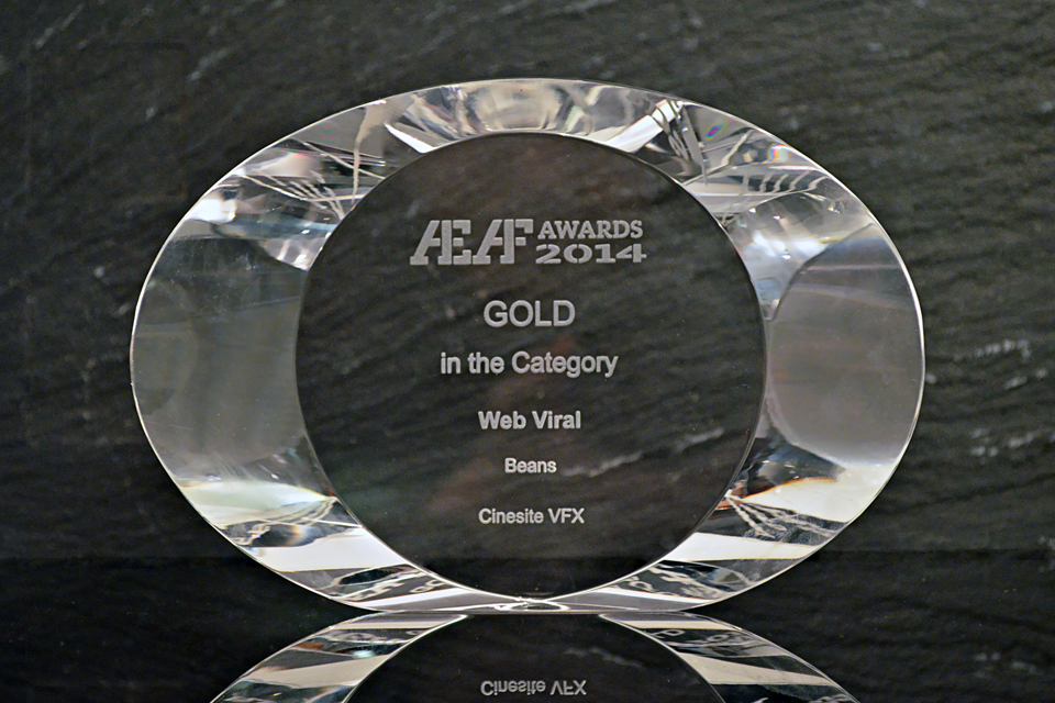
3D Artist: Beans – Cinesite’s First in House Short
Cinesite releases its very first in-house animated short with ‘Beans’, which was written and directed by animator Alvise Avati and produced by animation director Eamonn Butler
Based in the heart of Soho, London, Cinesite has been creating world class visual effects for everything from the Bonds and Harry Potter to Underdog and World War Z. However, the team had never created their own in-house animated content until now with Beans: a short film featuring a group of astronauts and a surprise ending. We speak to animation director Eamonn Butler, who produced the short, to find out more.
Congratulations to everyone at Cinesite for having created your very first animated film! Can you tell us more about what was behind the inspiration to showcase Cinesite’s creature animation skills within your own short?
Thank you, we are all very excited about it. Normally we come in at the end of somebody’s schedule and help them get some cool visuals, but in this case we decided that we wanted to create something for ourselves and here we are seven months later!
I wanted us to develop creatively and I wanted to use everybody on the team to have input on it. We designed it ourselves and we wrote the story ourselves. We knew we could make the visuals, that was always sort of a given but the fun stuff was coming up with the idea and designing everything. It was really great to see everybody work on it and develop all these extra skills that we weren’t even aware of until we threw this out there.
Alvise came up with the idea, and he did some storyboards and an animatic and we developed our camera move and developed our schedule based on that because we only built what you can see. So, the landscape only goes as far as where the creature comes out of the crater, and behind that is a 2D Matte Painting. All the astronauts are basically the same models but display texture variations and we just put effort into what you see, so for example the monster has a lot of sophisticated muscles and skin work on him, but we only put them where they show up so there’s very little on his back because obviously in 90 percent of the project you’re looking at his belly. So you put all the effort into that, and his mouth, his face, and we very very carefully layered in lots of sophistication to make it look cool. And that allowed us to get it done in a fairly short space of time!
Start to finish it was seven months, but we had a core team of about eight people that would jump on and off. And we threw in a few extra people at the end by the end of November so in all about 16 people. But I’d say that wasn’t full on if you pulled all of us together and treated it as a regular project you’re looking at about 3 months but because we fitted it around the other shows that we’d been doing we’ve been sort of doing it in our spare time and at weekends and stuff like that.
Was the aim to have it be fairly realistic?
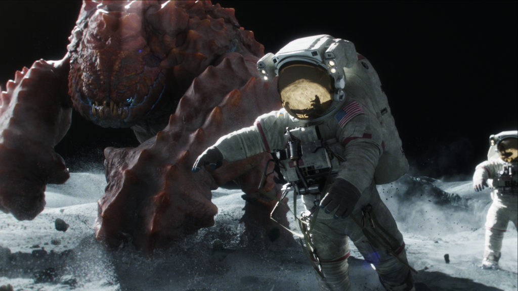
Yes the initial storyboard had a cartoon vibe to it but I felt like we’re in the business of photorealism as a company and I thought we should leverage off of that. We’ve got lots of amazingly talented people that can pull of lots of sophisticated imagery and I think playing up the reality of the first two seconds of the film and placing the audience on the moon circa the 60s and then flipping that idea on it’s head when the giant space lobster shows up kind of makes it funnier for me, and it takes a really fun idea and makes it really epic and grand and I think that adds to the flavor.
Can you tell us more about the pipeline and the tools and software used?
Everything you see was animated in Maya, rendered in Renderman, and composited in Nuke – all standard stuff for us. I think we purchased one plugin for Nuke to help us with lens flares stuff like that. We modeled the astronauts in Mudbox and Maya, and used Mari for textures. We were playing around with the scale of the creature, and at first we had a colouration that made it look very earth bound – sort of greys and browns that wasn’t looking as interesting as we wanted it to. Then we started looking at crustaceans and lobsters and creatures that live in the earth that have quite outlandish colour schemes, and then it got really interesting. We were working with Sculptris, which is a free program and really really quickly because the tool was very easy to use – you can’t do the kind of modelling you can do in Mudbox or ZBrush but it allowed me to sketch out simple forms, passed that model on to Alvise and he would take it then add some stuff and give it back to me. In a few days, we came up with a blocked out creature that we felt ticked the boxes in terms of silhouette and scale.
I think the most fun we had was coming up with the creature, the astronauts were very heavily based on photographic reference that we found of the Apollo 17 space suit and within three seconds we wanted you to think it was moon landing footage, so it had to be exactly like the imagery that we are all familiar with. One decision we made really early on and stuck to our guns with is that we always wanted the astronauts to struggle to get away from the creature, that was kind of the fun of it. Meanwhile, the creature has normal movement, he can move quite quickly and he looks quite heavy. He’s really pissed off these guys have landed on his planet and he doesn’t want them there so he gets rid of them, and he doesn’t just get rid of them he utterly destroys them, so that when the last guy shows up hiding behind the rock you understand the jeopardy. So we had to be really epic with everything up front, including his scale – we had to make him larger than life and added lots of jiggle and skin deformers.
Was working on an original animated short very different to Cinesite’s other work?
Mostly in visual effects sometimes you’re involved creatively very early on and sometimes you’re just coming in at the end, trying to make things work and sit right in the plate. What was nice about this is we became our own clients. We even made the astronauts have badges based on real NASA badges where the name of each member of the crew is stitched in.
Everybody working on it had very high standards as to how it would look visually – I mean you have to if you want to work in this business. Everybody had a say, everybody could contribute to it. One of the hard things was fitting it around all the other movies, it made it difficult to schedule it but I think if this is successful and people like it and it brings us work, we definitely want to do at least one a year every year, and I just love the idea of doing something creative.
It also allows us to develop our creature pipeline and push our tools so it’s the coolest creature thing we’ve got on our reel – very up to date, very current and I’m hoping that when people see it not only will they like the film but it will attract more of that kind of work for us too. It has already started inspiring lots of ideas for the next one!

