3D Total: Cinesite’s Beans – Animated Short
Beans is the first animated short film to be made at Cinesite. Animator Alvise Avati and animation director Eamonn Butler reveal all in an exclusive ‘making of’ feature
Beans on toast
As far as animated shorts are concerned, Cinesite’s Beans is pretty short. But as a display of high-resolution, terrifyingly real creatures in stark lighting, it ticks all the boxes.
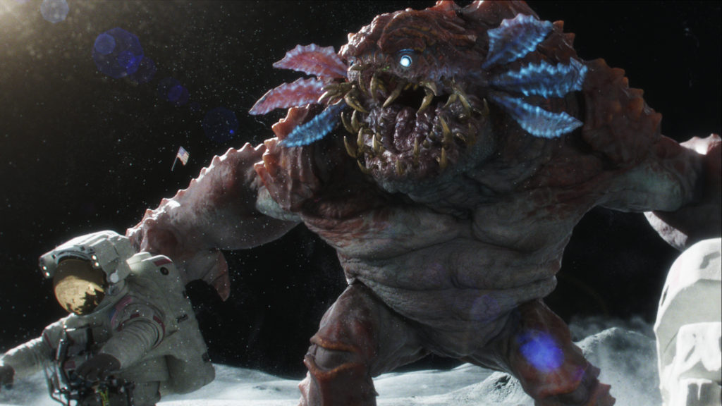
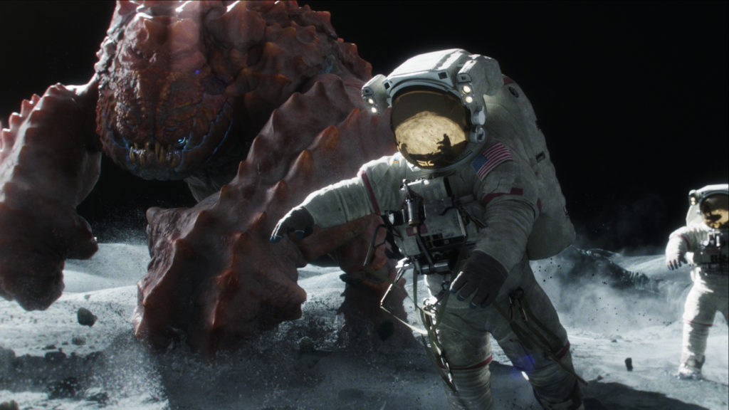
The storyline is very, very simple. Astronauts proudly plant a flag on the moon’s surface before a crazy, angry local suddenly appears. What happens next? Click the link below and watch.
You’ll watch it once, and then you’ll want to see it again, and again. Each viewing gives you a deeper understanding of the effort taken by this high-end crew of artists at Cinesite.
The Cinesite directors have been looking at animated content as a potential business area for some time. « Over the past few months,” says Cinesite managing director Antony Hunt, « we’ve been looking at ways of developing and showcasing the skills we have in-house.” Beans is a short, cheeky, 50-second film with an unexpected ending. Written and directed by animator Alvise Avati, it was completed by the London-based team at Cinesite, who were behind the visual effects on World War Z, Skyfall, Iron Man 3 and many other major productions. They have recently also completed work on 300: Rise of an Empire, Jack Ryan, Into The Storm and The Monuments Men.
As you would expect, the short features high quality modeling, texturing and technical effects, but most importantly, it demonstrates the world-class standard of the Cinesite animation team.
Brief biographies
An internationally renowned animation director, the producer Eamonn Butler is equally at home in visual effects and character animation. Working in the US for 10 years with Walt Disney Feature Animation, his credits included Fantasia 2000, Dinosaur, Reign of Fire and Chicken Little. Since moving back to the UK his visual effects credits have included John Carter, Harry Potter & the Order of the Phoenix, Paul and the forthcoming Tom Cruise sci-fi action film Edge of Tomorrow.
Alvise Avati is the director and animator of Beans, and he has worked on a few other shorts lately. Italian by birth, Alvise studied art at the Liceo Artistico Donatello in Rome. He became interested in animation, having inherited a passion for storytelling from his father, Italian film director and producer Pupi Avati. After getting his first break at Weta Digital as animator on King Kong, Avatar and other titles, he moved on to ILM in San Francisco for Transformers: Revenge of the Fallen, before moving to London.
Background
Cinesite was looking for ideas for a short while Alvise was working with them on the Tom Cruise sci-fi Edge of Tomorrow, coming out later next year. He approached animation director Eamonn Butler with a concept and animatic for Beans, which was just what Cinesite was looking for.
« I’ve always been interested in commercials, and this was a way of building my portfolio and developing ideas,” says Alvise. « What I love about the commercial format is the discipline required to tell a story in just 25-30 seconds. Good commercials are like short films; they are a great way to communicate ideas quickly and persuasively. » What appealed to Eamonn immediately about Beans was the opportunity for Cinesite to be creative and generate their own content. From Alvise’s animatic, he knew straight away that it would be perfect for what they were looking to do.
« Beans is self-contained, short and it could also be completed in a relatively short time frame, so it ticked every box for us,” says Butler. « With the skills we have here, I knew we could add great production value and have a lot of fun making it. We began work in May 2013 and finished it at the end of October.” Part of the problem of working so hard on movies at some houses in VFX, is that the reel is full of the studio’s IP, and they have to wait for permissions to show what their own crew can do. This was a way for Cinesite to break that cycle. « You have to bid a show, then win the show, then do the work and wait for the movie to come out before you can put it on your reel, and it’s that reel that attracts that kind of work,” explains Butler. « Come hell or high water, we needed to update the reel within the year!”
Research
Alvise had already begun researching looks for Beans and Cinesite continued with gathering photographic reference from various moon missions, plus NASA photographic footage of the moon landing. This had to look extremely real. Right down to the one source lighting, the glare off the lens and the blooming of the stark rock and dust. « Then comes the lunar beastie!” adds Eamonn. « I’d been waiting to develop a culture of creativity in the company which we could show off in our own time; as soon as possible.”
At the start of the short, it had to quickly establish a realistic environment, to set the context of the film on the moon in the viewer’s mind. It had to push the photorealistic effects hard to show off their skills. VFX supervisor Richard Clarke researched camera types used to film on the moon; they were generally 70mm with a fixed focal length. Audiences are used to seeing moon footage with a big depth of field, so Cinesite tried to replicate that.
Also, because it is so bright on the moon, cameras don’t pick up stars, so they kept space dark in order to be photographically accurate. Adding dust and halation to the lens meant that they could have some visual interest in the part of the frame where the stars were expected to be. Alvise adds: « In Beans, the astronauts move very slowly, which is very close to reality and what we would expect to see on the lunar surface. Unlike the spacemen, the monster’s movement is not inhibited by gravity issues; this was a creative decision to have the astronauts impeded by the lower gravity but not the monster. We needed him to look huge, weighty and powerful as he utterly destroys the astronauts. »
Making the beastie
The alien monster was created in a collaborative way, with Alvise sculpting, Eamonn adjusting and the whole team involved in generating the look. Cinesite is a Maya house for animation, and the creature was rigged in Maya as well. Mind you, it was created initially in Sculptris, the kit that Pixologic bought-out some time back. « This package is really quick to use, very simple so I could sketch the general shape and ideas very fast,” Butler explained. « I’d pass it to Alvise to work on, and he’d pass it back to me to get my thoughts. Some software encourages you to get in under the hood very quickly, but when you do that you stop being creative and you just fiddle, so we stayed loose and then we took it into ZBrush and also MARI for the textures.”
MARI was also used for the textures of the spacemen’s suit, and ZBrush and Mudbox for the rocky lunar landscape.RenderMan was the renderer for the final push.
The Cinesite creatives wanted the creature to be big, bipedal, with short, stocky arms and a little head, but it took them a while to settle on his color. « We attempted versions in brown and grey, which blended in too much with the environment,” adds Butler. « In the end, we settled on a less saturated red color, so the creature looked suitably alien and other-worldly. We also added a lot of dirt and dust on the creature’s skin which really helped integrate it into the environment.”
Butler was inspired by J.J.Abrams’ bright red monster that greets Captain Kirk when he lands on the alien planet in Star Trek. It had to look completely out of place on the surface. The added color made it fit better and seemed like it didn’t like being out in the sunshine at all. Perhaps he/she was just upset and wanted to get up and obliterate the astronauts and then get back inside its hole. Fair enough, too.
Alvise had initially wanted his eyes to glow, particularly when he comes out of the shadows at the start. FX were created to give realistic dust being kicked up from the moon’s surface. « Initially, our highly realistic dust simulations created using Houdini looked like CG particle animation, so we introduced a layered approach. Some were simple, with particles reacting with each other, some were fluid-based. Some were cloudy and others clumped together. The team created several dust passes and tweaked the gravity on each dust kick to make it look better,” says Avati.
In reality, big rocks and dust actually fall at the same pace on the moon, but when it was created for the short, it just didn’t look right, so they made adjustments. Thinking back to Apollo 12’s astronauts jogging about kicking up the dust may have looked cool on the news footage but it didn’t look right in the clear view. But the dust effects helped demonstrate how powerful and dynamic the monster was, and they also helped cover up the gory bits.
Lighting
Eamonn bought this book called ‘Moon’, which is a big set of NASA photographs from the moon missions. « One of the images really stood out,” he describes. « One image looked black and white but if you look really carefully, it’s actually a full-color picture. The only way you can tell is that the lunar rover has gold fenders on it. It looks completely monochrome.”
It was decided that back-lit, high-key and the really deep dark shadows were important. Then with a very long depth of field, it was extremely bright. On the TV footage, the tube cameras used back then left blooming and soft edges. A little bit of that perception was brought back in the render, to give a notion of that TV broadcast look. « Otherwise it would have looked fake,” quips Eamonn. Yet the one element was the single high key light of the sun. « We added dirt on the lens, a bit of flare, some aberration.”
Animation pipeline
Two rigs were used for the animation, with Alvise working on keyframe animation while Eamonn simultaneously worked on the muscle rig with the other. Changes were made in tandem, with muscle controls added as required, based on the requirements of the animation. Both rigs and the process allowed for quick updates as they went along, giving the animator a lot of freedom.
Alvise contributed most of the animation. Essentially, he only animated the muscles you could see, so areas like the creature’s foreground attacking arm had far more control, allowing for finer animation detail to be added. Ultimately, there were about 38 controls. He used a combination of shape targets and clusters to generate muscle tightening and bulging. « We do tests for projects all the time, but they are not something we can put online and show. Visually, I think Beans is compelling, cool and the scale is epic,” says Eamonn. « It hooks the audience from the very beginning with its realism. It’s believable and at the same time it’s slightly ridiculous. We’ve created an awesome creature, but essentially it’s all about the laugh. The humor in Beans is universal; no language is required; everyone gets it. We’ve had a lot of fun making Beans and I hope that people have as much fun watching and sharing it.”

