DIGITAL MEDIA WORLD : Cinesite’s New Animated Short Film Blasts Off
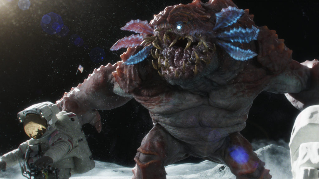
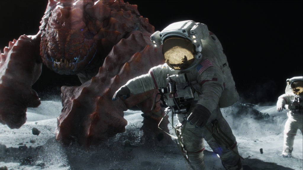
Cinesite has been interested in producing some of their own animated content for some time, and have now released their first animated short – a sci-fi themed spot set on the moon with a frightening alien creature, photoreal visual effects – and an unexpectedly humorous ending.
Creating their own animated project has given Cinesite a chance to demonstrate their creature skills and develop their creative team. Although this project was slightly different than usual in that the team was working to Cinesite’s own ‘brief’, nevertheless director and writer of ‘Beans’ Alvise Avati developed the story idea by initially working with simple storyboards and then made an animatic using the same drawings from the boards.
From Animatic to Previs
Animation director and producer Eamonn Butler also commented that starting with storyboards is the quickest way to find out whether you have a movie. “From the animatic, we moved into previz,” he said. “This was developed over multiple versions to refine the camera work, staging and blocking of the performances. It also helped when scheduling modelling, rigging and animation, and figuring out what we needed to build, what could be broken out for matte paintings and so on.”
They started with pre-production in May 2013 and finalised the project at the end of November 2013, not working on it exclusively throughout that time but fitting it in among their other production work. At first only Eamonn and Alvise were involved, working on the monster design and other conceptual developments like the astronaut suit, landscape and animation references for the astronauts. Later, they had a core team of about eight people who covered most of the production, with another eight people jumping on to help finish towards the end.
Camera Design
The camera work in the piece is engaging because it quickly accelerates to become almost frantic, stays low and close to the ground, and helps build the feeling of disaster, similar to a character’s point of view. Alvise said, “Good camera work can make poor animation look much better, but bad camera work can make an epic animation look small. Eamonn and I knew from the beginning that the camera was going to drive the performance of all the characters in the scene, so we wanted to stay as close to them as possible.
“This way we’d be forced to move the camera faster, more frantically. I believe this decision added further energy to the whole animation performance. Usually, the lower you keep the camera POV, the grander the subject of the scene will be. Because we wanted the monster to look big, we put the camera at about 80cm from the ground, using something close to a 30mm lens.”
“We set the camera so that you’re looking slightly up at the eye lines for the astronauts, which also made the monster look really massive,” Eamonn said. “We kept the camera moves natural, reacting to the action, and deliberately wanted the cameraman to have trouble framing this monster, to give a feeling of surprise and an impression of spontaneity.”
Sculpting the Moonscape
The lunar surface is a 3D model sculpted in Mudbox mainly by modeller Royston Wilcocks, and was based on high resolution images of actual moonscapes. The mountains in the background are a 2D card matte painting added in Nuke during compositing. “We did extensive research on photographs taken on the moon,” Eamonn explained. “But what really inspired us was a book called ‘Full Moon’, which features many lunar landscape photographs. By studying these images, we found out that there was almost no chroma in the lunar landscape and no colour whatsoever, which meant that any flash of colour really stood out against the monochrome background.
“We used this fact to help guide the audience’s eye to where they needed to look in the frame to follow the story. At the beginning of the film the flag is the brightest, most colourful object and draws the viewer’s eye immediately. This helps set up the context of the story. We matched the environments very closely to the real surface of the moon, and because it was important that the audience identify the location quickly as possible, realism was always our goal.”
Toward that goal, visual effects supervisor Richard Clarke researched camera types typically used to film on the moon – generally 70mm with a fixed focal length – and photo reference was used to create the astronaut suits and environments. “Most of the astronaut suit design comes from the Apollo 17 mission suit,” Alvise said. “There is plenty of reference for it on the web to look at, and we liked the design. We wanted to use the extravehicular activity version, EVA, which has mechanical paraphernalia hanging on the astronaut’s chest looks more interesting than other versions.”
Monster Maquettes
The monster design is essentially Eamonn’s creation. He sculpted two monster maquettes using Sculptris, a simplified version of Zbrush. They decided that both of them, with a similar ‘crustacean’ look, were quite effective, so in the end they combined the best parts of each maquette’s design into the final model. “We knew we wanted the monster to be bipedal, powerful and huge,” Eamonn said. “As we played around in Sculptris to sketch our 3D model, we focused at first on simple forms, and within a few days settled on a pleasing silhouette. We passed the blocked design to modeller Graham Curtis to flesh out using Mudbox.
The low gravity lunar conditions and heavy space suits, of course, placed some interesting restrictions on the animation. The monster is the only character depicted in his ‘own’ environment with all freedom of movement. “We gathered and watched a lot of NASA videos, studying how lack of gravity would affect the astronauts’ movement,” Alvise said. “But we immediately realized that these astronauts would have to run faster than real ones, despite the laws of physics – otherwise they would have been killed by the monster in seconds!
“At the same time, we wanted them to look both clumsy, due to their heavy suits, and bouncy and light enough to sell the idea of the lack of gravity. The most important point for us was the contrast between the way the monster was moving compared to the astronauts. We wanted to sell the idea that the monster belongs on the moon and the astronauts don’t.”
Performance Differences
The same rigging techniques were applied to both the astronauts and the creature, and the animators then revealed the differences through movement with animation. “We decided the creature should not be affected by the moon’s gravity the way astronauts were, as the story required the astronauts to have great difficulty escaping the monster’s grasp,” explained Eamonn. “We studied video footage of astronaut’s motion on the moon and applied it to our animation, and always wanted the monster to be able to move quickly.
“To help give the monster more mass and scale, we added controls to bulge and jiggle his muscles and skin. This meant that every time he punched the ground or took a step, the audience would feel his weight, even though on the moon it would probably not react that way. We used our established pipeline as it existed for this project. What we pushed was the quality of the performance, rendering and lighting in order to enhance the story.”
Making this short film opened several opportunities for Cinesite. First, it meant they could update the menagerie of characters in Cinesite’s creature animation reel with an up-to-date, completely original, epic monster animation.
“Second, we got to be creative,” Eamonn reflected. “We came up with the story, designed the creature, created the look and made a short film. It exposed everyone involved to new processes and was a natural progression for us from working as an established service provider to functioning as a content creator. I see in-house projects like this as essential to our creative development and it’s something we are committed to doing more of in the future.”

